Game UX - Frustration on steroids
-about Dragon Ball: Sparking! ZERO-
🇬🇧 This article is also available in English here: click click.
I’m far from being the best fighting game player, but if there’s one franchise — one specific series — that left a mark on my childhood, it’s Dragon Ball Z: Budokai. Playing as Goku, Vegeta, and their allies was something I absolutely loved back then. I still remember the excitement of coming home from the used game store with a newly found Budokai title for the GameCube, and the pure joy of booting it up after the long wait in the car.
So, when Bandai made a grand announcement about a brand-new installment — the heir to Budokai Tenkaichi after so many years — I naturally let nostalgia and fond memories take over. Without hesitation, I jumped at the chance to buy the worthy successor to a series that had been left on the sidelines for too long. It was time to reconnect with the soul of these games that first made me fall in love with versus fighting.

So, with undisguised joy, I launched the game and began exploring the various menu screens and the combat experience it had to offer. Of course, between my younger self and who I am today, a notable difference emerged — I now pay much more attention to the overall experience than before. With the sheer number of games being released nowadays, it’s easier to spot aspects that might be frustrating for players who are more inundated with choices than ever.
I’d like to add a small disclaimer before diving deeper into the topic. This article should be seen as an essay based on personal experience. I haven’t conducted in-depth research to see if others have proposed similar solutions — my perspective is mostly shaped by feedback I’ve gathered or read online, along with my own time with the game.
It’s also important to keep in mind that this is more of an isolated design exercise. After all, we can never propose a true “miracle solution” without knowing the technical and logistical constraints behind the production of a game like this, nor the challenges the development team has already faced in bringing it to life. The goal here isn’t to “do better” but rather to theorize an alternative vision of its execution.
One of the main points of friction I noticed concerns the combat itself. Although I’ve been playing video games since childhood, I know I’m far from being among the best at this genre. To get a feel for things, I jumped into a few online matches to see where I stood after all these years without playing a Dragon Ball fighting game. Unsurprisingly, I wasn’t very good. I found myself facing strong opponents who knew the game’s mechanics inside and out, mastering all its nuances with ease.
Discouraged by my struggles online, I decided to switch to story mode and work through the various offline objectives in solo play. Unsurprisingly, I quickly understood the common complaint from experienced players who find the difficulty lacking.Even without being particularly skilled or deeply familiar with all the gameplay nuances, I didn’t face many challenges in my progression — not even against iconic enemies who should have been major roadblocks. Strangely enough, it wasn’t the fights themselves that disrupted the experience but rather what happened outside of them.
A Menu That Feels Cumbersome to Use
The very essence of Dragon Ball: Sparking! ZERO is combat. The game is built around a core experience that emphasizes Player-versus-Player battles, primarily online, where dedicated players will find the challenge and intensity they crave.
That said, story mode remains a key component of the Budokai series. These games were known for their unique approach to progression, first introduced in the early entries: a mission selection system where players moved a small character across world maps inspired by the iconic Dragon Ball universe.

What stands out when launching the game is the sheer amount of effort put into crafting a unique and visually striking menu. Unlike standard menus found in most games, this one is enriched with 3D scenes inspired by the anime, featuring our favorite characters in iconic environments.
The main menu boasts a technical polish far beyond most modern productions when it comes to navigation elements. And ironically, that’s where its biggest flaw lies.
With each flick of the joystick, with each press of an arrow key, the player is taken to a new scene through a smooth and carefully crafted camera movement, but one that is particularly long. The transitions between each submenu suddenly take an excessive amount of time, whereas before, a cursor could instantly move from one panel to another within the same list.

Accessing options or customizing a character for battle now becomes a process that adds up to several minutes of navigation. And that’s not even counting a possible slip or an accidental press of an arrow key, which doubles this frustrating time (going to the wrong menu and then returning to the desired one).
Attack of the clones
A large roster of fighters has become somewhat of a gimmick in fighting games. With Super Smash Bros. Ultimate offering 80 selectable characters, most games in the genre now emphasize their vast selection of fighters — so much so that it can become difficult to navigate.
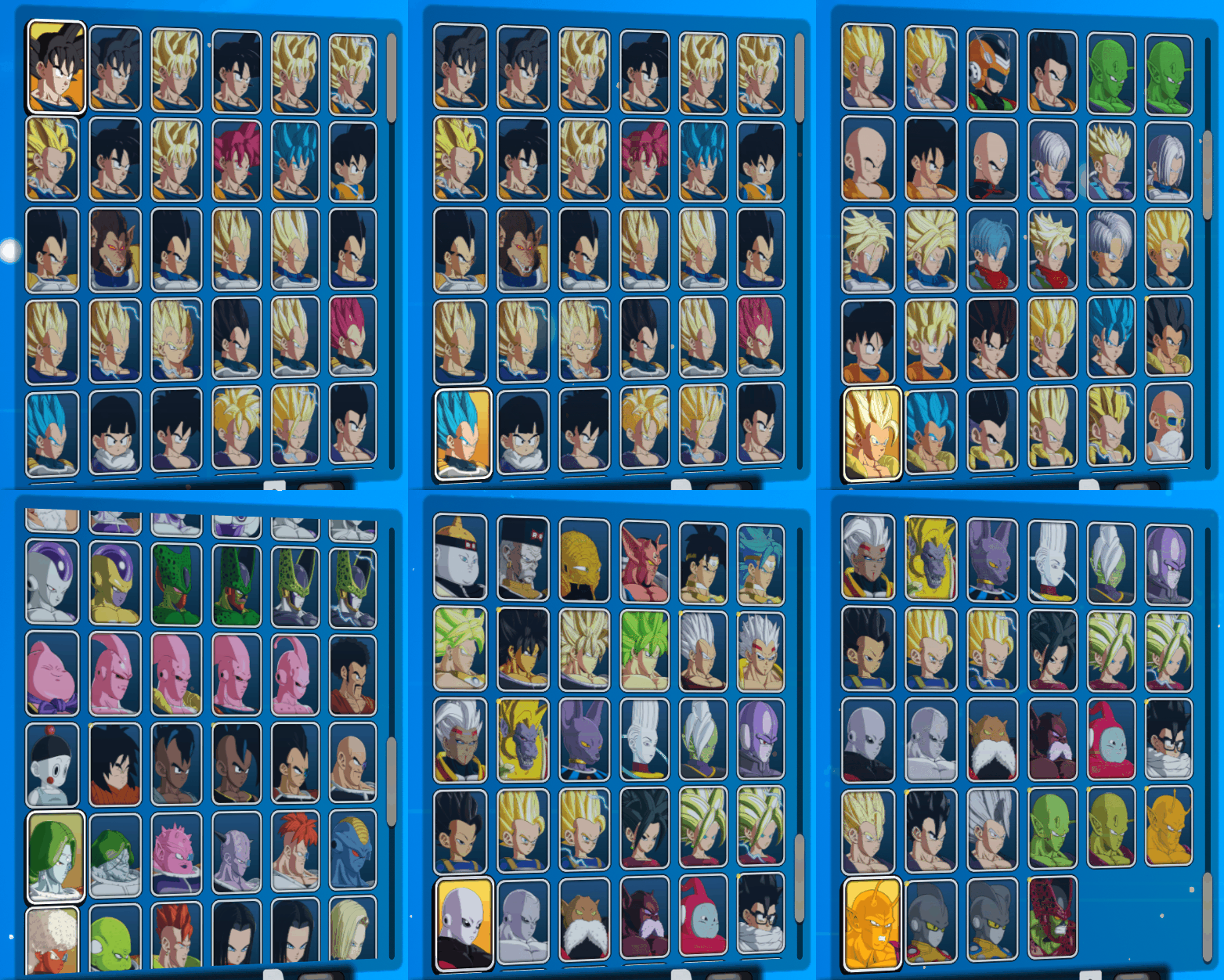
Riding the wave of Dragon Ball’s various story arcs to offer multiple versions of the same character significantly extends navigation time and presents players with an overwhelming abundance that tends to hinder the decision-making process. More choices lead to more hesitation.
Given the similar nature of most characters and the need for consistently balanced matches — where the main differences stem from player skill and decision-making — it would be preferable to present fewer characters but implement a “skin” system, offering cosmetic outfit choices for each one. By pressing a button while hovering over a character, a secondary panel could display the different outfits available, allowing for a smoother and more intuitive selection process.
Currently, we have the choice between a very exhaustive menu displaying all character versions (more or less depending on additional content — 136 in my case) or a more condensed menu (still featuring 73 characters, some appearing multiple times again) that does not allow players to view or select hidden alternative outfits.

By adding a button for selecting alternative outfits, the game could drastically reduce navigation time while still offering the full range of options for each character individually.
The current “light” version, offering 73 choices, could remove around twenty more while still providing the option to select from the full 136 of the “extended” version through a two-panel system.

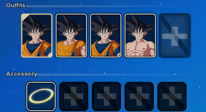
And all this is without counting on the fact that each character variant can potentially have “alternative costumes”, in another customization menu where an “Outfits” category is also present.
Secret missions too secret
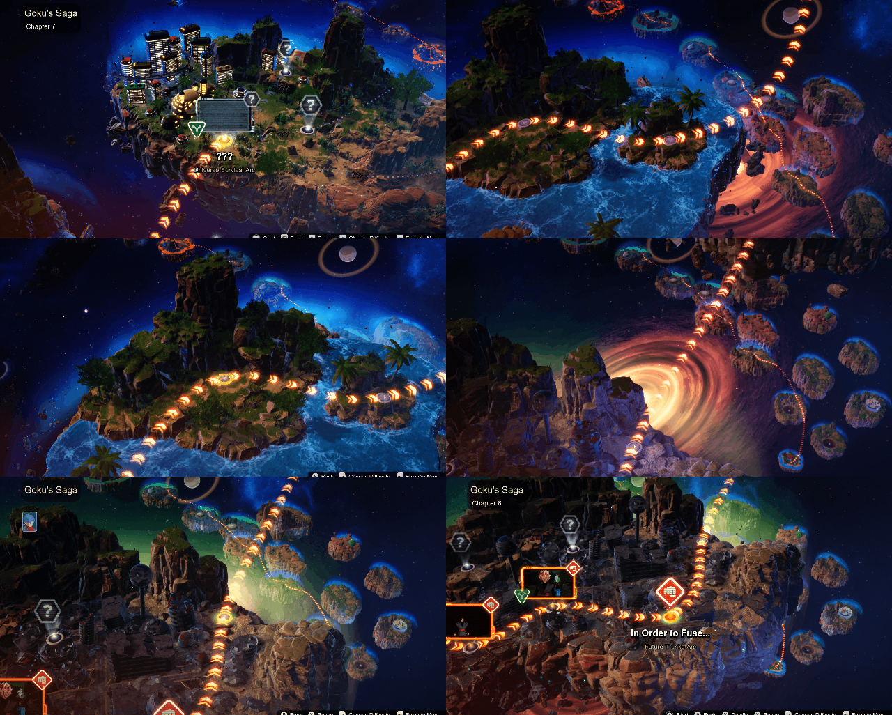
In the story mode, it is possible to walk different paths according to certain characteristic actions that we perform during the fights. However, the way to unlock these alternative paths depends on each key character faced and, if we do not have the information of what we must do, it is not clearly displayed, potentially blocking paths and leaving players in the dark about what to do. These hidden missions are sometimes very specific, we can completely miss the secret methodology requested even by restarting the fight several times.

The already slow navigation through key story points is made impossible at times by mysterious question marks as the only clues that make the puzzle impossible to solve.

In this menu, the slow navigation does not encourage you to go back to consult other paths or events, but rather to resume where you left off because retracing your steps is too restrictive and long. A faster consultation of this world map would have been more appreciable.
The missing consistency in small gestures
Creating consistency in the behavior of your inputs always helps the user to make the most of their product. It is this consistency that creates habits, and the lack of consistency can create frustration. When the same button acts differently to perform the same action, it multiplies the possibilities of confusion and input errors.
For example, if you have to hold down a key (here, B) to return to the previous screen, but at some point you only need to press the same key to return to the previous screen, you can quickly make a series of errors, thus multiplying the navigation time in menus, creating a restrictive inconsistency, which thus gives rise to frustration. The multiplication of this variety of input creates an accumulation of constraints and potential accidents which increases the possible frustration generated by these clumsy manipulations.
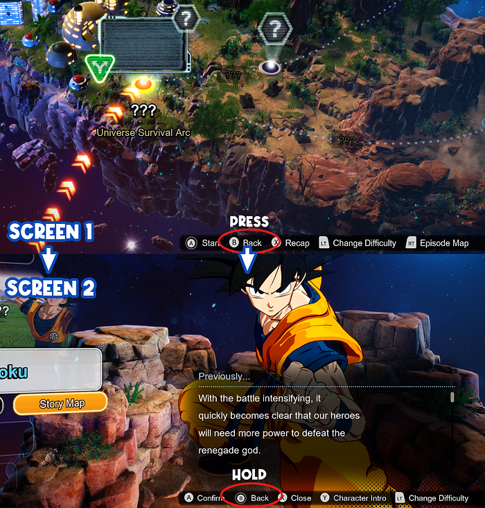
Some flows in the menus are also different on the “Go” path and the “Return” path, also contributing to some confusion. When each action in the main menu and each dive to a different level of information costs long seconds of animation and camera movements, the lack of display of certain panels creates additional actions, therefore time.

A somewhat spread out story mode
The development team decided to offer an “Episode Battle” mode, the equivalent of a Story mode, that is to say fights that follow a narrative framework (based on the original manga) divided by a choice of character. You can therefore embody your favorite character and go through the story from his point of view, thus following his adventure. For some who arrive much later and leave much faster (beaten by Goku in particular), the narrative arcs are necessarily shorter.
However, for players who want to do all the points of view, this way of approaching the split story will inevitably present redundancies, because certain fights will have to be seen from the point of view of the two fighters concerned.
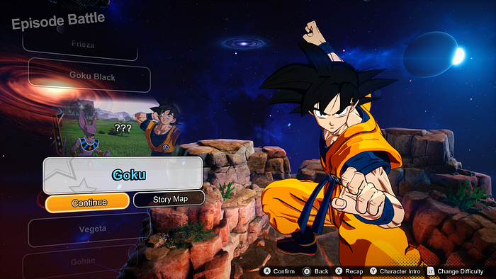
On this point, I personally preferred a more linear progression that would give us the opportunity to play as different characters while following the overall narrative in its entirety, arc by arc. However, it is very wise of the studio to offer the possibility to sometimes play as the enemy side rather than Goku’s team, when certain enemies are known to have generated a lot of interest from fans. Playing as Vegeta or Black Goku when they are considered Goku’s direct rivals and allowing players to see events from an alternate reality is a good way to offer more exclusive content to the game, compared to the choices made to advance the original material.
